009BRAND · GYM BRAND IDENTITY
PowerLift – Fitness Gym Brand Identity System
A performance-driven brand identity built around a barbell-integrated monogram for a strength-focused gym.
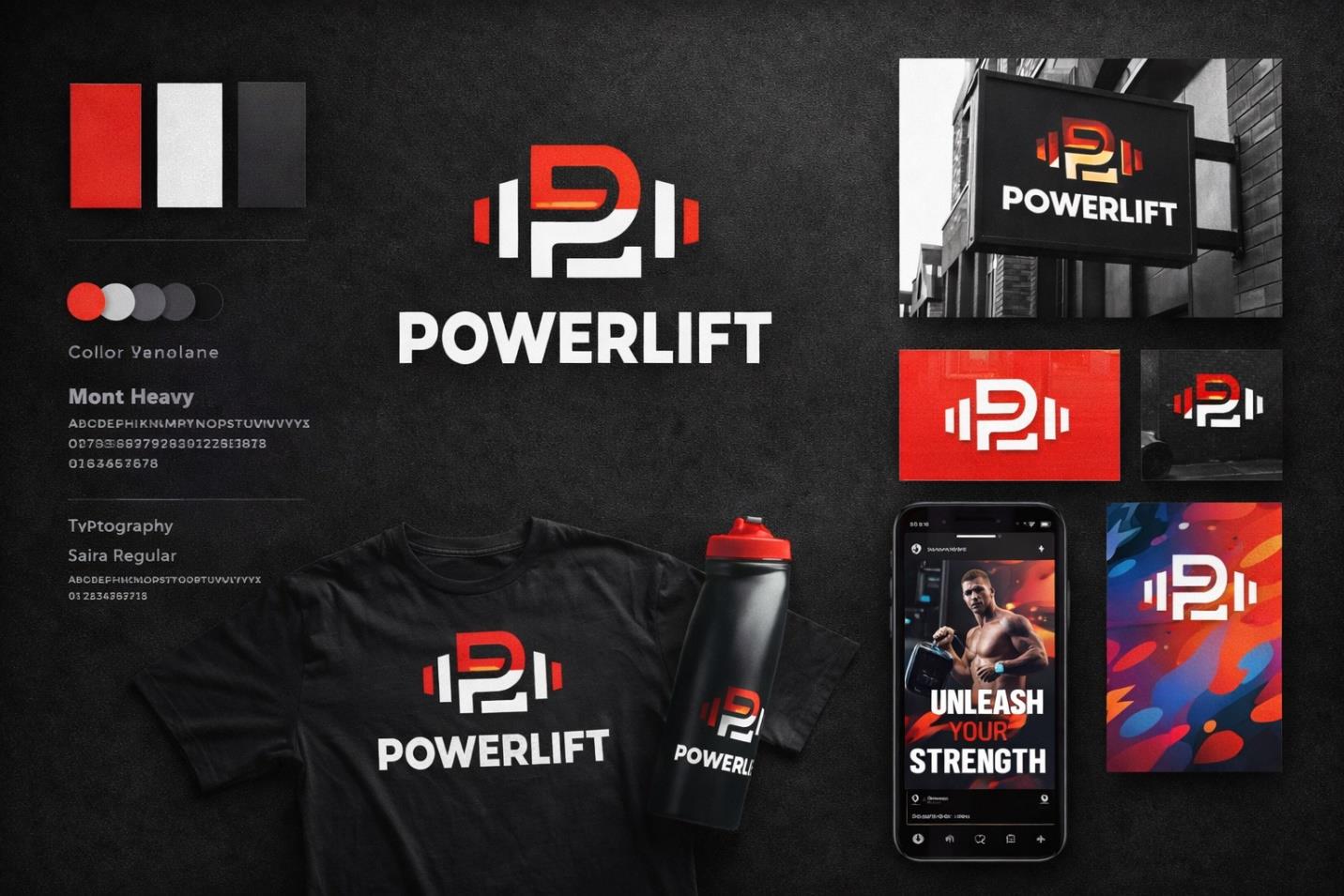
OVERVIEW
PowerLift is a strength-focused fitness brand, and this project involved building the full visual identity it needed to compete in a crowded, image-conscious market. The brief spanned logo, palette, and typography through to merchandise, signage, and social presence, giving the brand one coherent language to speak across every physical and digital touchpoint it occupies.
THE CHALLENGE
The brand needed to stand out in a saturated fitness category, communicate strength at a glance, and hold up equally well on a t-shirt, a shaker bottle, and an exterior sign. It also needed to feel serious rather than generic — bold without collapsing into the visual clichés the category is full of — while remaining flexible enough for merchandise and marketing use.
RESEARCH & STRATEGY
The approach drew on what makes fitness identities work visually: high-contrast color systems, heavy typographic weight, and iconography that is minimal but purposeful. The palette was narrowed to red, black, and white, chosen specifically for intensity, authority, and clarity, and the strategy centered the monogram as the one asset able to carry the brand's meaning on its own.
ART DIRECTION
At the center of the system is a custom P-shaped monogram that quietly integrates barbell structure into its form, paired with heavy sans-serif type and a strictly high-contrast application of the palette. The overall aesthetic stays minimal but aggressive, favoring strong shapes and hard edges over decoration, giving the brand a personality that reads as strong, competitive, disciplined, and high-performance wherever it appears.
EXECUTION
The identity was rolled out across logo variations, a gym signage mockup, apparel including a t-shirt application, shaker bottle merchandise, a social media promotional post, and a supporting brand pattern used as background texture. Each application was built to reinforce the same visual authority rather than reinterpret it, so the system reads as one brand regardless of surface.
OUTCOME
The finished identity positions PowerLift as a serious, performance-driven gym brand, ready to extend into merchandise, facility branding, and ongoing marketing without losing consistency. The monogram in particular gives the brand a single, ownable mark it can build recognition around over time.