011PRINT · CORPORATE BUSINESS CARD
Executive Minimal – Corporate Consultant Business Card Design
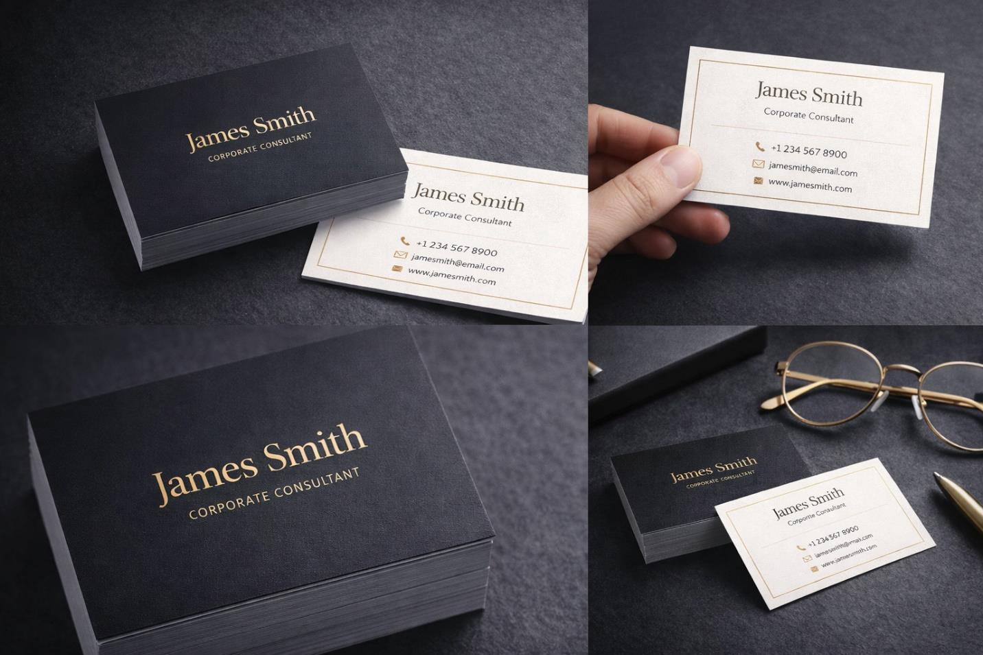
A restrained black-and-gold business card built to signal executive authority for a corporate consultant.
OVERVIEW
This project involved designing a minimalist business card for a corporate consultant looking to elevate their professional presence through a more considered print touchpoint. The brief was narrow in scope but exacting in standard: a single card that needed to feel authoritative the moment it changes hands.
THE CHALLENGE
The card needed to project executive authority and feel premium in physical print, all while avoiding clutter and staying grounded in a corporate context. The central difficulty was achieving impact through restraint — proving that elegance and confidence can be communicated with very few elements, provided each one is placed with precision.
RESEARCH & STRATEGY
Professional-services branding tends to rely on limited palettes, strong typographic contrast, and disciplined spacing, and the strategy for this card followed suit. Black was chosen as the dominant field to project authority, gold was reserved for typography to signal prestige, a serif nameplate was selected for refinement, and a subtle framing border was added to give the composition quiet structure.
ART DIRECTION
The front carries a matte black field with gold-accented serif typography for the name, while the reverse shifts to a clean ivory ground for contact information, keeping the two sides distinct in function but unified in tone. Minimalist iconography and generous spacing throughout give the card a personality that reads as authoritative, sophisticated, professional, and trustworthy.
EXECUTION
The card was built as a front-and-back system: an identity-focused front and an information-focused reverse, each produced as a premium print-ready file alongside a high-resolution mockup presentation. Every element was optimized with foil stamping or metallic ink application in mind, so the design would translate cleanly into a physical finish beyond standard digital print.
OUTCOME
The finished card gives the consultant a premium, executive-level touchpoint that strengthens credibility in networking and client settings, doing the quiet work of first impressions before a conversation even begins.