003PACKAGING · PACKAGING SYSTEM
Organic Botanicals – Clean Skincare Packaging System
A shelf-ready packaging system for an organic skincare line, built to feel pure, premium, and consistent across every SKU.
OVERVIEW
This project built a cohesive packaging identity for a modern organic skincare brand launching a cleanser, a hydrating face cream, and an eye cream together. The goal was a scalable system that reinforced the brand's commitment to natural ingredients and premium formulation across every product in the line, not just a single hero item.
THE CHALLENGE
The packaging needed to communicate purity and botanical authenticity while still standing out, if subtly, in a crowded skincare market. It also had to remain consistent across three different formats — bottle, jar, and tube — without feeling repetitive or losing individual product identity. The key challenge was balancing softness with structure: a system gentle enough to suit organic skincare but disciplined enough to command shelf presence.
RESEARCH & STRATEGY
Research into successful clean-beauty brands pointed toward muted, earthy palettes, minimal typography, botanical line illustrations, and generous white space as consistent markers of trust. That research shaped a strategy centered on a calming visual identity that reflected organic ingredients and gentle skincare benefits, built from a limited, considered palette rather than a wide decorative range.
ART DIRECTION
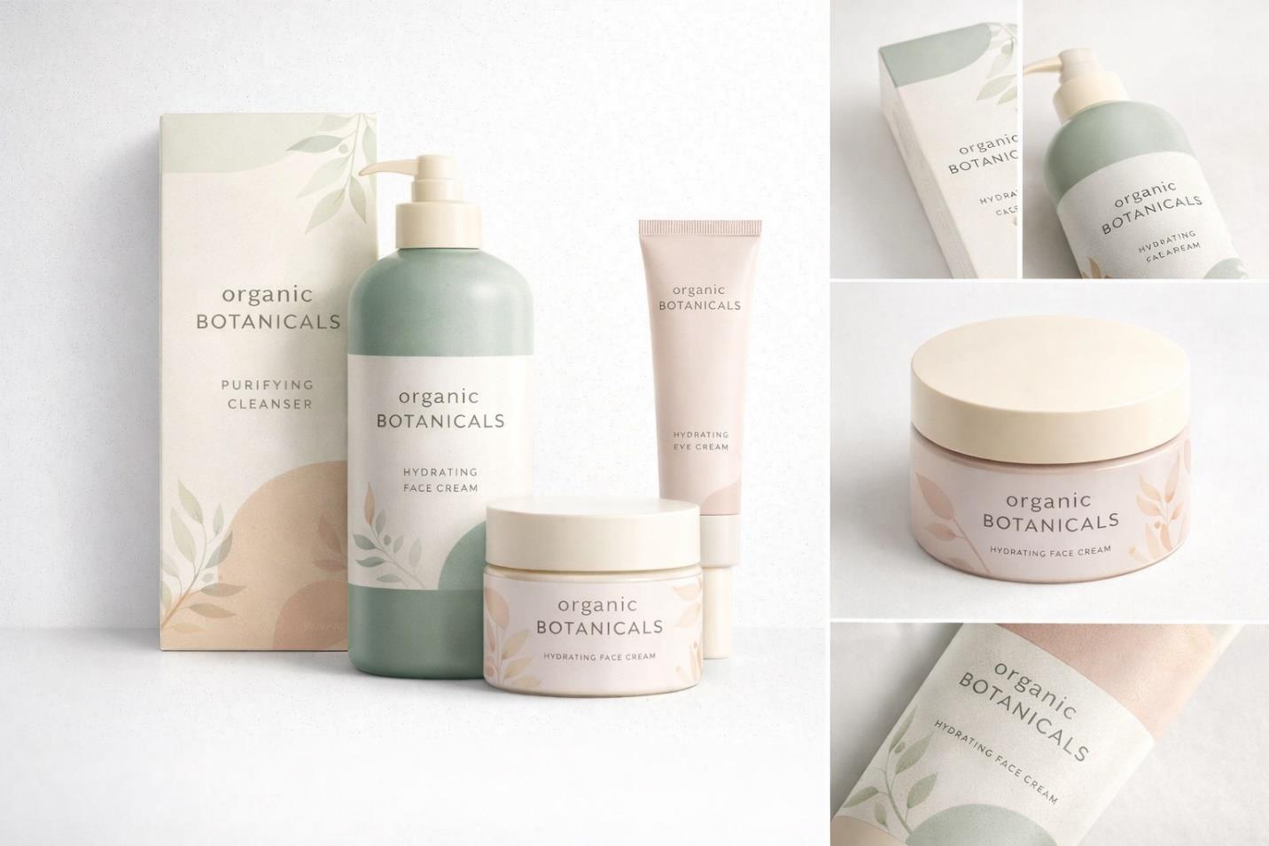
The visual language rests on sage green and blush neutral tones, with soft botanical illustrations worked subtly into the layout rather than dominating it. Refined sans-serif typography keeps ingredient and product information legible, while balanced, breathable spacing lets each label feel considered rather than crowded. Across the range, labeling is harmonized so the eye immediately reads the products as one family.
EXECUTION
A master brand layout was developed first and then applied consistently across the pump bottle, jar container, product tube, and folding carton box. Each SKU was refined to clearly identify its function — cleanser, hydrating cream, eye cream — while sharing the same typographic and color language, so the full range reads as a single coherent system on shelf or in a product photograph.
OUTCOME
The completed system delivers a refined, shelf-ready skincare identity aligned with modern organic beauty standards. It supports both physical retail display and digital storefront presentation while reinforcing a consistent sense of brand integrity across every product.