001PRINT · EVENT POSTER SYSTEM
Live Music Night – High-Impact Event Poster System
A neon-charged poster system built to carry one concert's energy across print, outdoor, and mobile screens.
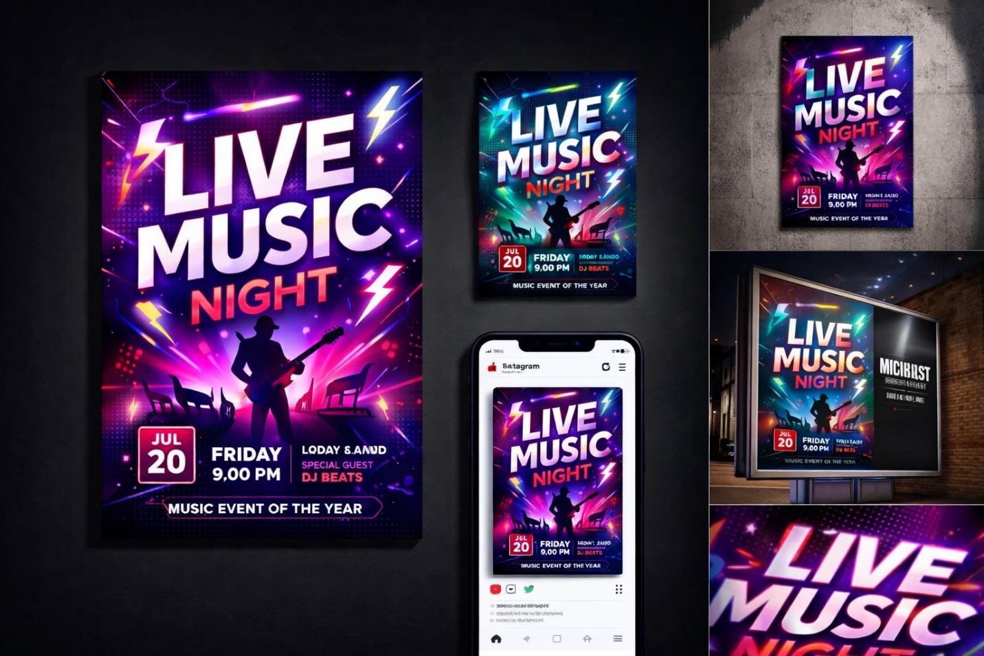
OVERVIEW
This project called for a promotional identity for a contemporary live music event, one capable of translating sound, movement, and stage energy into a single striking campaign. The brief spanned formats rather than a single asset, requiring a visual language flexible enough to hold up on a billboard and on a phone screen alike. The resulting system became the event's entire public face in the weeks before doors opened.
THE CHALLENGE
The event needed to cut through a saturated entertainment market while speaking directly to a young, nightlife-driven audience. It also had to function across genuinely different contexts: towering outdoor placements, dense social feeds, and printed handouts, each with its own demands on scale and legibility. The central tension was holding onto raw, high-energy visual excitement without losing the clarity of who, what, and when.
RESEARCH & STRATEGY
Audience research pointed toward strong engagement with neon-lit, high-contrast imagery within music and nightlife culture, so the strategy built outward from that instinct. Electric gradients in purple, magenta, and cyan were paired with a silhouetted performer as the emotional anchor of the composition. A clear typographic hierarchy was layered on top, ensuring that event details never got lost beneath the atmosphere, while a modular structure let every element resize gracefully across formats.
ART DIRECTION
The visual direction leans into neon glow effects that simulate stage lighting, with lightning-bolt accents used sparingly to heighten a sense of voltage and motion. Bold uppercase type anchors the composition, arranged around a centered hero figure for maximum visual dominance. Controlled depth and shadow work give the poster an immersive, almost three-dimensional quality, while an underlying grid keeps the excitement disciplined rather than chaotic.
EXECUTION
Work began with a master vertical poster that established hierarchy, color, and typography for the entire system. From that anchor, the design was adapted into an outdoor billboard treatment, a mobile-optimized social version, and a detail-focused close-up composition, each recalibrated for its viewing distance and context. Typography was tuned specifically for outdoor legibility, since much of the campaign's reach depended on being read at speed and from afar.
OUTCOME
The finished system gave the event a single, cohesive visual language that could be deployed identically across billboards, feeds, and print without losing coherence. It captures the intensity of a live performance while keeping essential event information legible at every scale, giving the client one campaign built for many touchpoints.